
Portfolio


Coming Soon


Coming Soon
CLIENT
ROLE
UI Designer
PROMPT
Park Radar takes the guessing out of street parking in Chicago. As a mobile application, the city database of parking rules can be accessed from your parked car to confirm your current location has legal parking.
CLIENT
ROLE
PROMPT
UI Designer
Park Radar takes the guessing out of street parking in Chicago. As a mobile application, the city database of parking rules can be accessed from your parked car to confirm your current location has legal parking.
This was a team assignment within DESIGNATION to develop an identity and visual language for a mobile application that helps users easily access Chicago parking rules. The concept was derived through the research findings of a separate UX team, who interviewed Chicago residents on why they visit the City of Chicago website. Our team focused on the UI design, and adapting the inherited wireframes for iOS. We worked in an agile environment, setting individual goals for each weekly sprint.
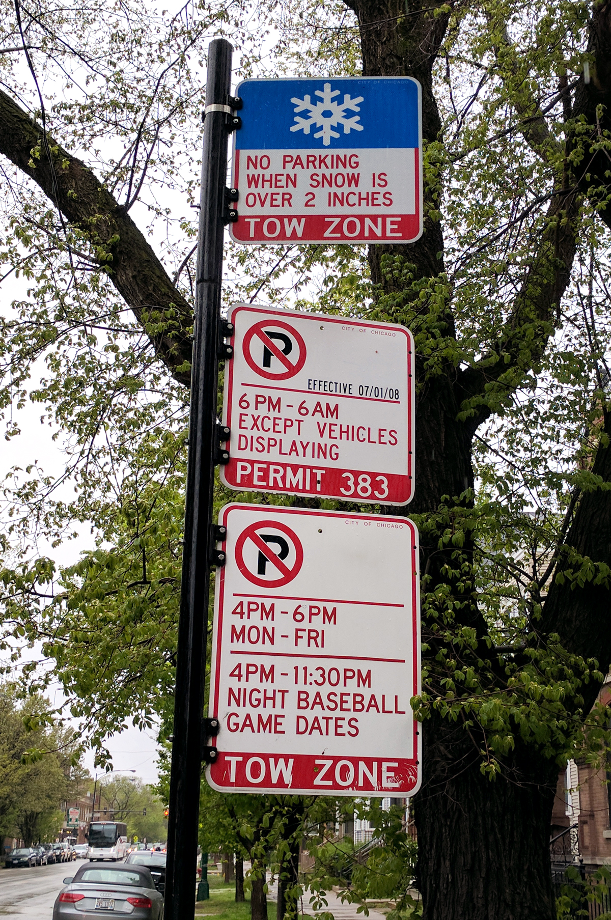
Street sign in Lakeview
The UX team found a strong need for easily accessible parking information due to the overwhelming amount of parking tickets distributed each year. Many stories were heard about violations resulting from misunderstanding the parking signs on the street where they were parked. Signs can be lengthy and confusing, and nuanced to the point of headaches. Through this research, an idea for an application was born.
Chicago drivers need a way to access very specific street parking rules in real time because ambiguous and inconsistent signs result in frequent violations.
Using the insights discovered around the difficulty of parking, the UX team designed and tested a responsive microsite for instantly checking legal parking on desktop and mobile devices. Through multiple testing sessions, the team was able to pare down the core features that users looked for the most, and integrate them into a map-focused home screen.


“Just tell me if I can legally park or not. Yes or No.”
–Robert, UX Prototype Interviewee
While the UX team was tasked with making a website, our UI team was then tasked with adapting the site for an app. As this app is intended to reach a broad audience of tourists and locals alike, our goal was to make it as approachable as possible. What changes can be made to make the app easier to view in a parked car? To help anchor our design decisions, we developed three team principles:

Keep it Simple
Keep maps at the forefront, do not overcrowd the individual screens with too much information. Use standard mobile patterns to limit the amount of on-boarding.

Keep it Friendly
Speak to the drivers like a human, and avoid legal jargon. Users are referencing the app in order to better understand street signs.

Give Directions
Give clarity to the parking zones using color to drive interaction. The design will have subtle hints of Chicago, to remind the user that it displays official city data.
The first change we agreed upon was moving the menu items from the hamburger menu to a tab bar. The app will only have three major functions, and it is unnecessary to have a full pull-out menu just for these.

The second thing we changed was removing the requirement to create an account. We decided to treat this app more like a bus tracker; an app that is easily referenced by newcomers and regulars alike.

The option to save addresses to be easily accessed later is moved to a favorites menu. This links the data to the phone memory as opposed to a separate account hosted by the Park Radar service.
After performing research and design decisions as a team, we then focused on our own separate UI designs individually. I personally designed and tested many iterations of how the parking information would be loaded and displayed. It’s the biggest piece of info that users will be opening the app for, so it needed to be as intuitive as possible.


Final
The tab bar drops down in order to bring up the pull-up menu with detailed parking information.
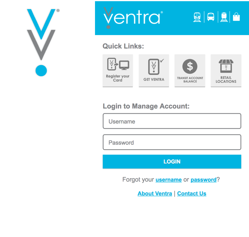
There is a ton of pride surrounding the flag with many Chicagoians. Many other transporation apps and other city programs sport the colors. I aimed for keeping in step with other Chicago apps (Divvy, Ventra, etc), and wanted Park Radar to feel like it belongs in the family.
Divvy
A bike share program in Chicago.

Ventra
An electronic fare payment system for the Chicago Transit Authority.
I pulled my inspiration from Chicago signage and other bold wayfinding graphics. The Chicago flag and its colors are featured prominently and proudly, with an abundance of red, blue, and six-pointed stars reinforcing the app’s origin and purpose.


We wanted to capture the feeling of a helpful sidekick by giving the app a short but catchy name that also accurately described the service. The term “radar” is memorable because the app signals parking around you when none appears to be there. I wanted to capture this visual with the logo.
The red and blue is derived from the Chicago flag, but is now paired with a yellow to help distinguish the three different types of parking information that are returned after a search. These are the primary colors of the app.


I explored developers tools such as Map Box, Snazzy Maps, and the Google Maps API to pick just the right type of map for the parking information to be displayed. The map shouldn’t be too distracting, and unnecessary labels can be stripped away. But there should also be enough context clues to help users orient their location quickly.


As the first project completed at DESIGNATION, I absorbed as much as I could about standard mobile patterns and iOS design guidelines to take with me throughout the rest of my time during the program. From being primarily an Android user, I personally had the goal to update my knowledge on where iOS has evolved and the latest UI trends that have emerged since my last interactions with the iOS environment. My team and I worked quickly and made changes often based on feedback received from other peers, our creative director, and potential users.
If there was more time allocated to this, I would have explored the parking card even more. Since completing this project, more trends have emerged in apps such as Google Maps and Uber where info cards can be pulled up from the bottom of the screen. I would love to work on designing the best solution that would work for both iOS and Android.
PROJECT DURATION
TEAM MEMBERS
FINAL DELIVERABLES
4 weeks
Visual competitive analysis, mid-fidelity wireframe revisions, hi-fidelity screen mockups, Proto.io prototype, logo, basic style guide
PROJECT DURATION
4 weeks
TEAM MEMBERS
FINAL DELIVERABLES
Visual competitive analysis, mid-fidelity wireframe revisions, hi-fidelity screen mockups, Proto.io prototype, logo, basic style guide
Coming Soon
